
Project context
Timeline
February 2022 - May 2022 (3 months part-time)
In February 2022, I join POP’s design team as a UX design intern. POP is an app focused on providing a safe space for college students to meet new friends in a convenient, stress-free and personalized way.
When I joined, the company was going through a major shift with the business strategy because of several issues: engineering wise, there were simply too many bugs with the app to really test the hypothesis with the users; market wise, the CEO wants to pivot to a bigger market to reach users beyond just college students. Financial wise, the metrics we got from previous implementation were not enough to raise a 2M seed round. So, I was basically thrown into a position to work on design during the time with a lots of uncertainty and ambiguously. Although it seems I have put myself in this chaos, the team as a whole aligned on some high level goals after doing market research, user interviews and competitive analysis.
High level goals
Modify our product for young professional and test hypothesis as much as we can
Sooner face-to-face meet up option
Improve the POP in feature experience since it is unique feature
make the App Usable
Go through the app and fix all the bugs and inconvenient experiences
No more focus on “New Feature”
Focus on young professionals and big conferences to market the product and keep iterating the product
I mainly worked on 3 things:
Improved user flow of the Pop In experience
Re-design the carousel of the customizable profile screens
Built a sitemap for the existing product
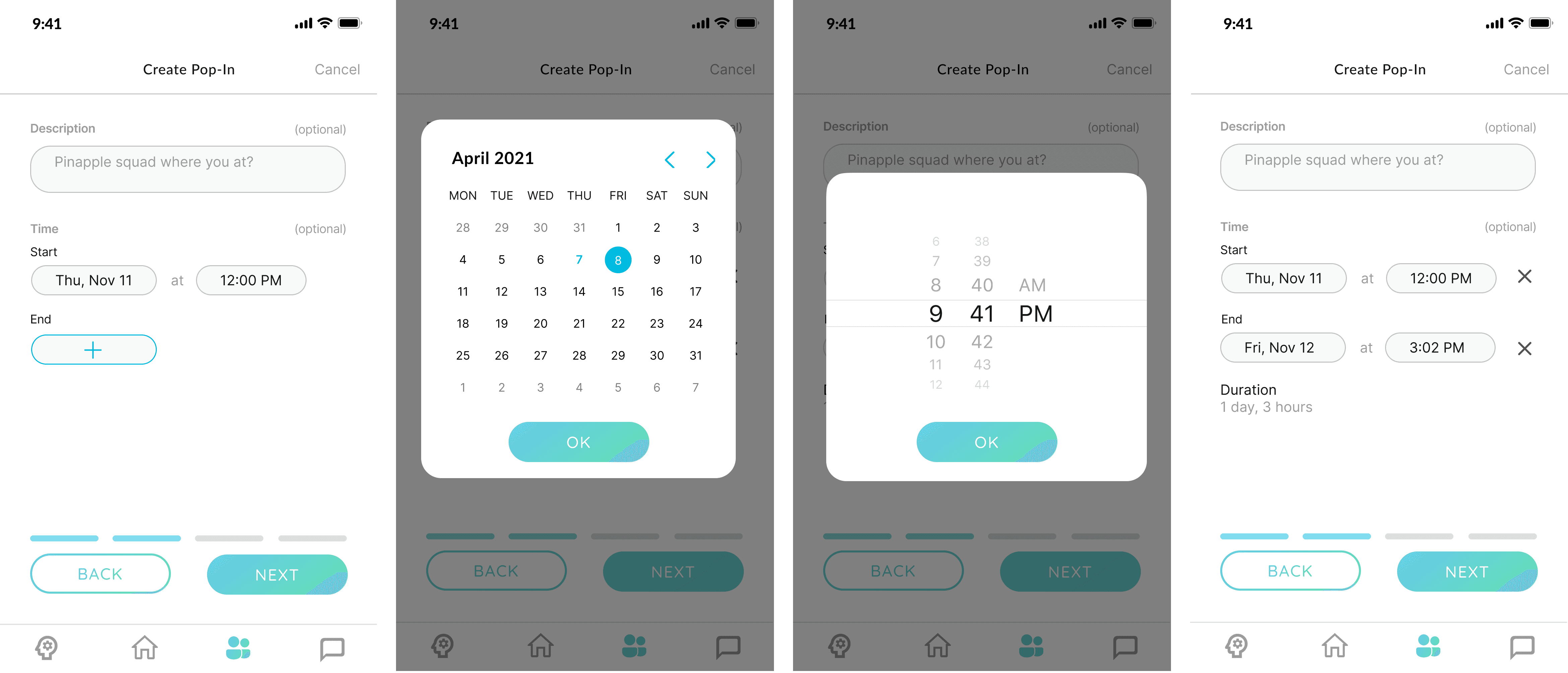
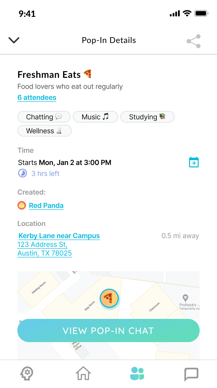
POP in experience redesign
Problem Statement:
Pop in is a unique feature which none of the competitors in the relationship building problem space is doing, however, the most valuable feature of the app is not very usable for the users based on previous user interviews. The average time spend on the app is 7 min per user, but to create a pop in takes about 1 min which is not a good metric as ideally user would spend more time in browsing Pop Ins to join and swapping through the carousal to find friend to match. Task completion rate is low and the error rate for creating the Pop In is also high for what we imagined ideally.
Solution
After examination of the flow, I have made a few changes and redesigned specific screens. The task completion time is lowered by 10% and the task error rate is lowered by 10%. So how did I do this?
Before vs After
Create pop in
Before
After

Chat experience
Before
After

Search experience
Before
After
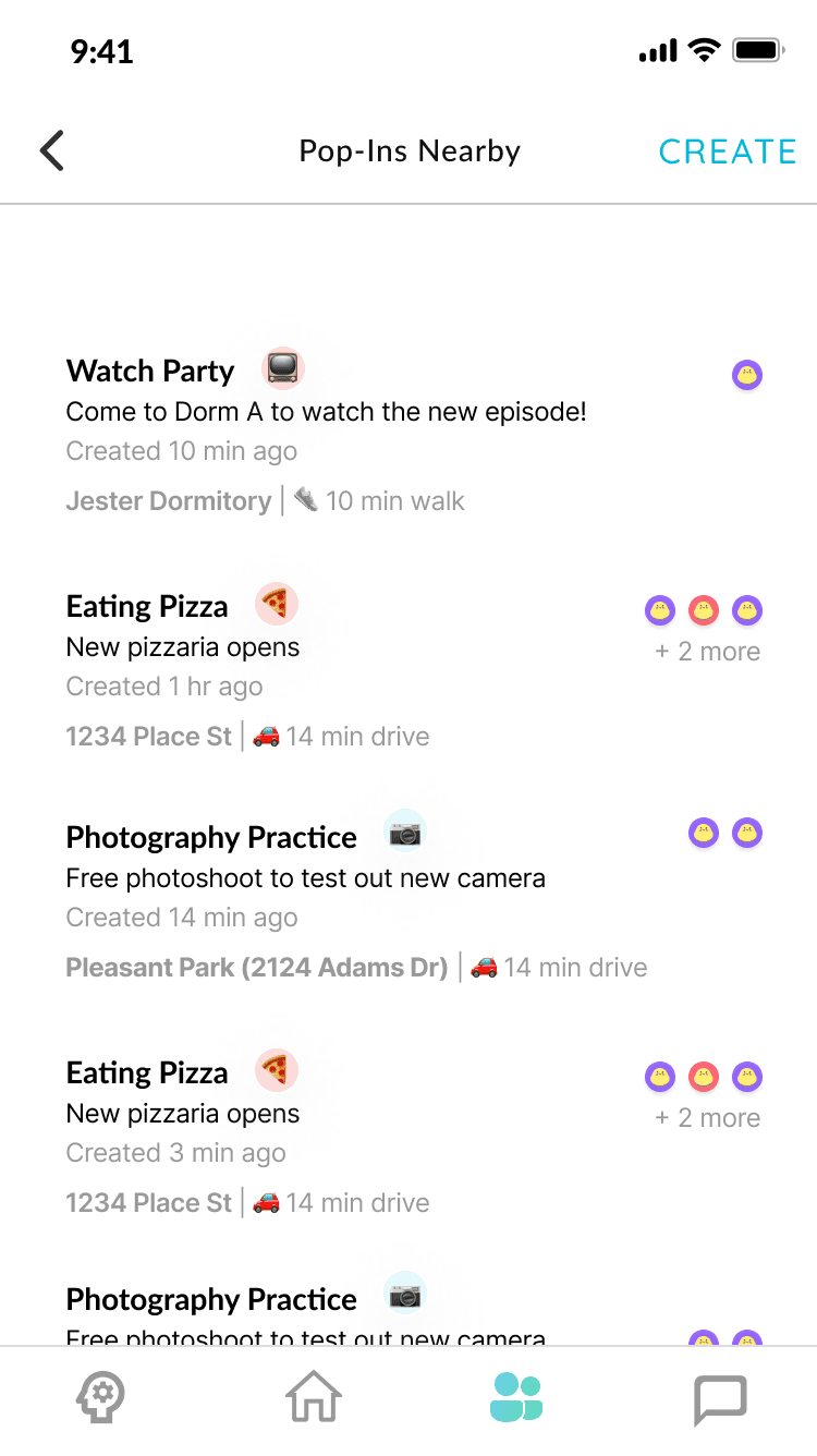
POP in nearby
Before
After


Reflection
The challenge of mobile design lies in the limited screen space, making it crucial to find the right timing to place CTAs. I need to carefully consider the right timing and location of the CTA or instructions to get desired user behavior.
© 2026 by Benyin (❁´◡`❁)