Influencer storefront
Helping creators build simple and inspirational storefront experience
Overview
Timeline
January 2024 - February 2024 (1 month full-time )
My Role
UX designer: Ideation, Information architecture, Navigation design, Rapid Prototype, User flow, Happy Path, Design Collaboration, Scope & Plan
Context
Loudcrowd wants to enhance the influencer storefront by providing functionality that matches the capabilities found in Walmart, LTK, and Amazon programs. The storefront should allow creators curate and organize products into multiple collections. The hope is that once this feature is implemented, the creators can create personalized storefront to attract more customers for the brands they collaborate with.
Problem
It is challenging to do a universal design that serves a template for all brands, since many has their own website style. Besides, Loudcrowd needs to enable easy login, product picking and making the creators interested in associating UGC with products in the collections.
Goal
Brands seek to provide functionality for their ambassador programs that matches the capabilities found in Walmart, LTK, and Amazon programs. So Loudcrowd needs to enhance the ambassador storefront with the hope that it would increase sales conversions for brands.
Solution&Impact
Version 0 (V0) has been implemented, although most of the design I have done are not included in this release due to time constraints. A demo showcasing how to add products to the ambassador storefront was presented during the end-of-month meeting following multiple rounds of testing.
So, how we got there?🧐
Strategy
Market Research
For the market research, we worked on gathering references for empty state, ambassador-controlled view, and buyer's view.
User Research & insights
Due to time constrain, we only conducted interview with Root Pretty's influencer. We want to have an idea what the influencer expects to experience creating their storefront.
Influencer believe that shoppable UGC (User-Generated Content) enhances the shopping experience for their followers. They find that integrating UGC makes the product discovery process more authentic and engaging, leading to a smoother path to purchase.
Influencer expressed a need for a simpler way to select products, such as a typeahead search feature or the ability to select products via a URL. This would streamline the product tagging process, saving time and effort.
There is a strong desire for UGC to be displayed immediately after the ambassador’s bio. Ambassadors feel this placement would ensure their followers can quickly access relevant content, improving the overall user flow.
Influencer want a clear prompt or guidance when landing on the product selection page. They noted that this would help reduce confusion and enable them to get started quickly.
When encountering an empty state, influencer wish for more guidance or direction on what to do next. This could involve tutorials, tips, or suggestions for how to proceed, ensuring they feel supported throughout the process.
User Story
We created the user story based on the user research so it can help us to see what influencer wants to achieve as their end goal.
As a influencer, I want to be told what to do 1st, 2nd and 3rd so that I can quickly set up my storefront without missing any key steps
1
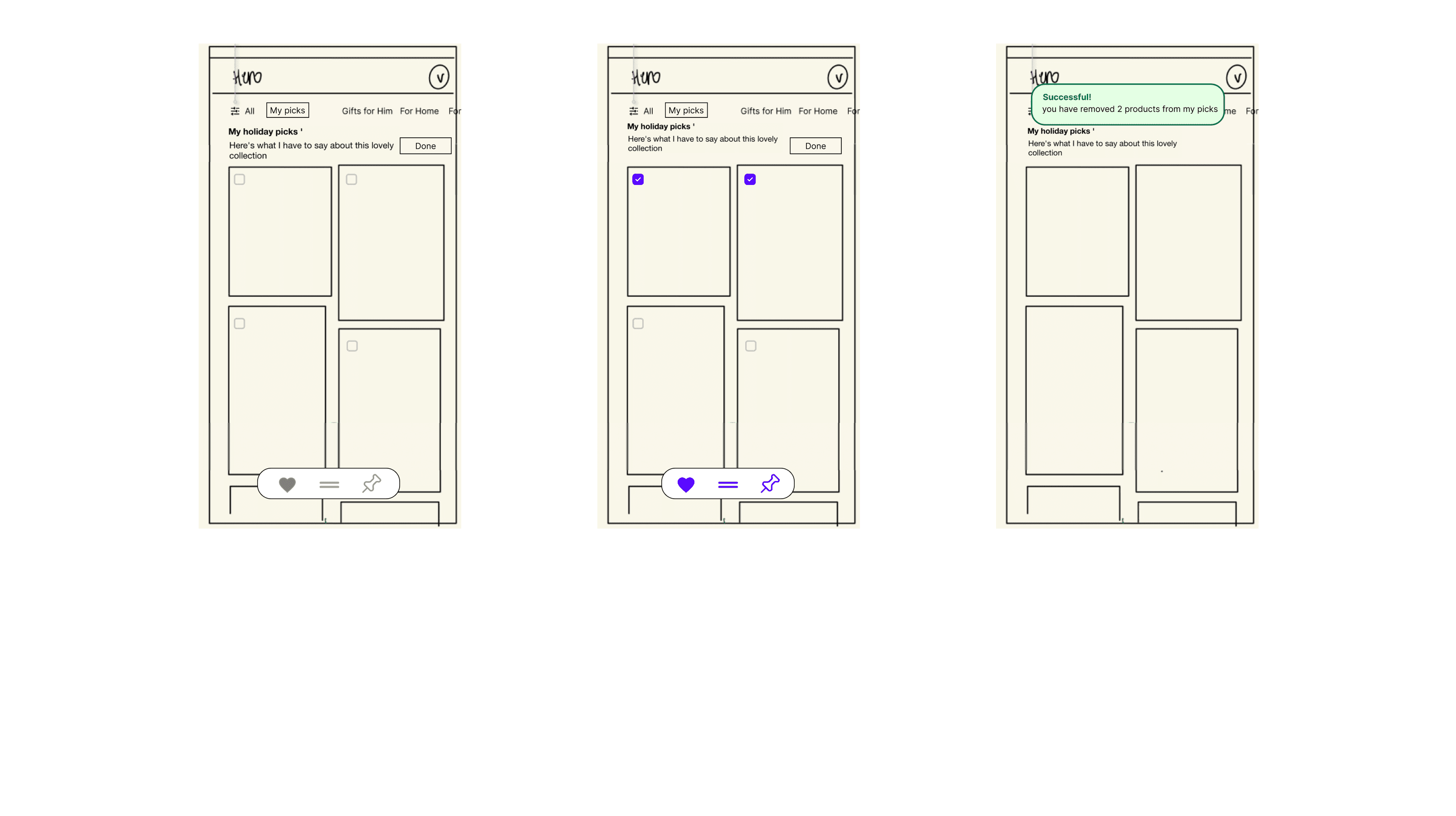
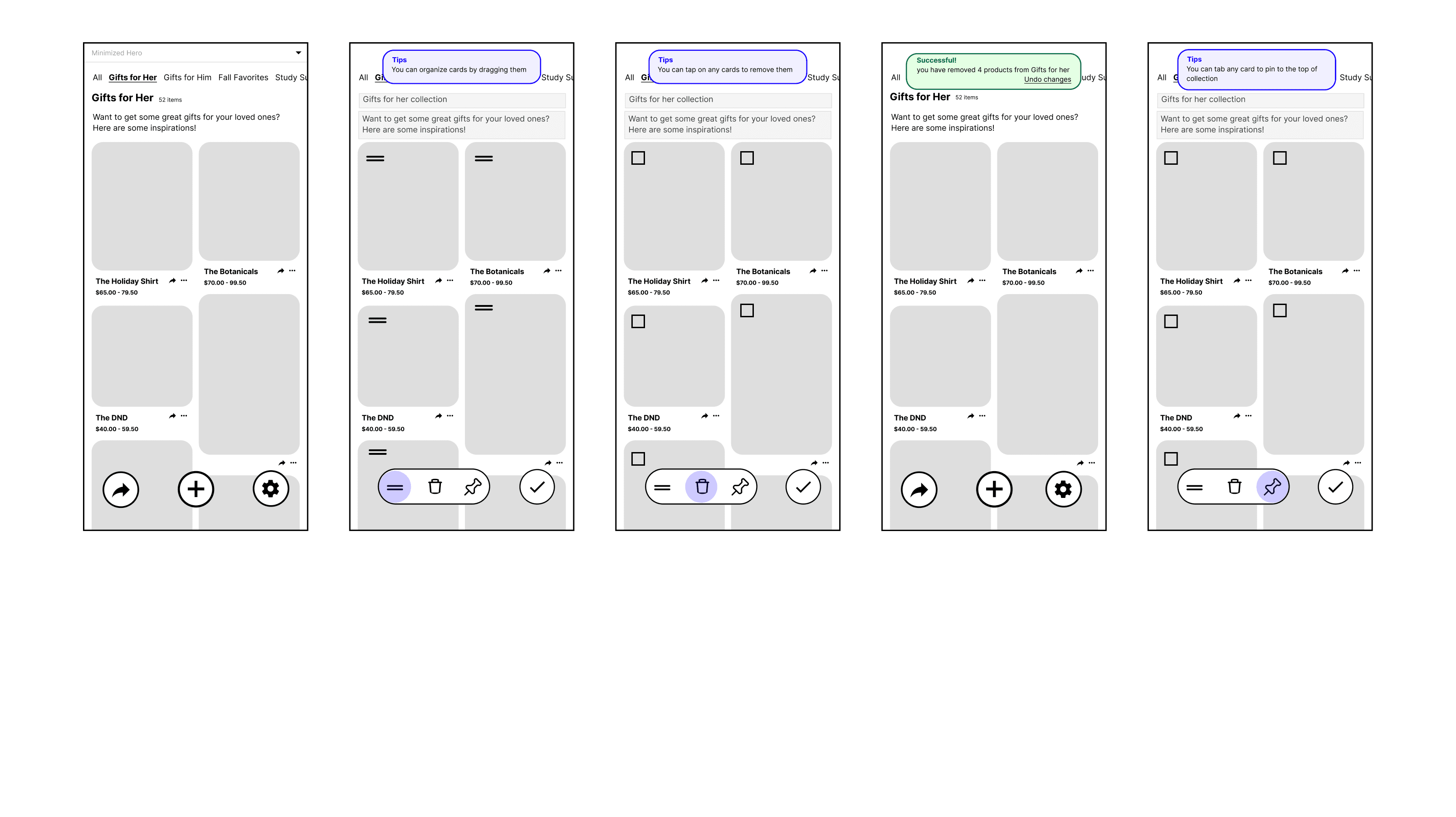
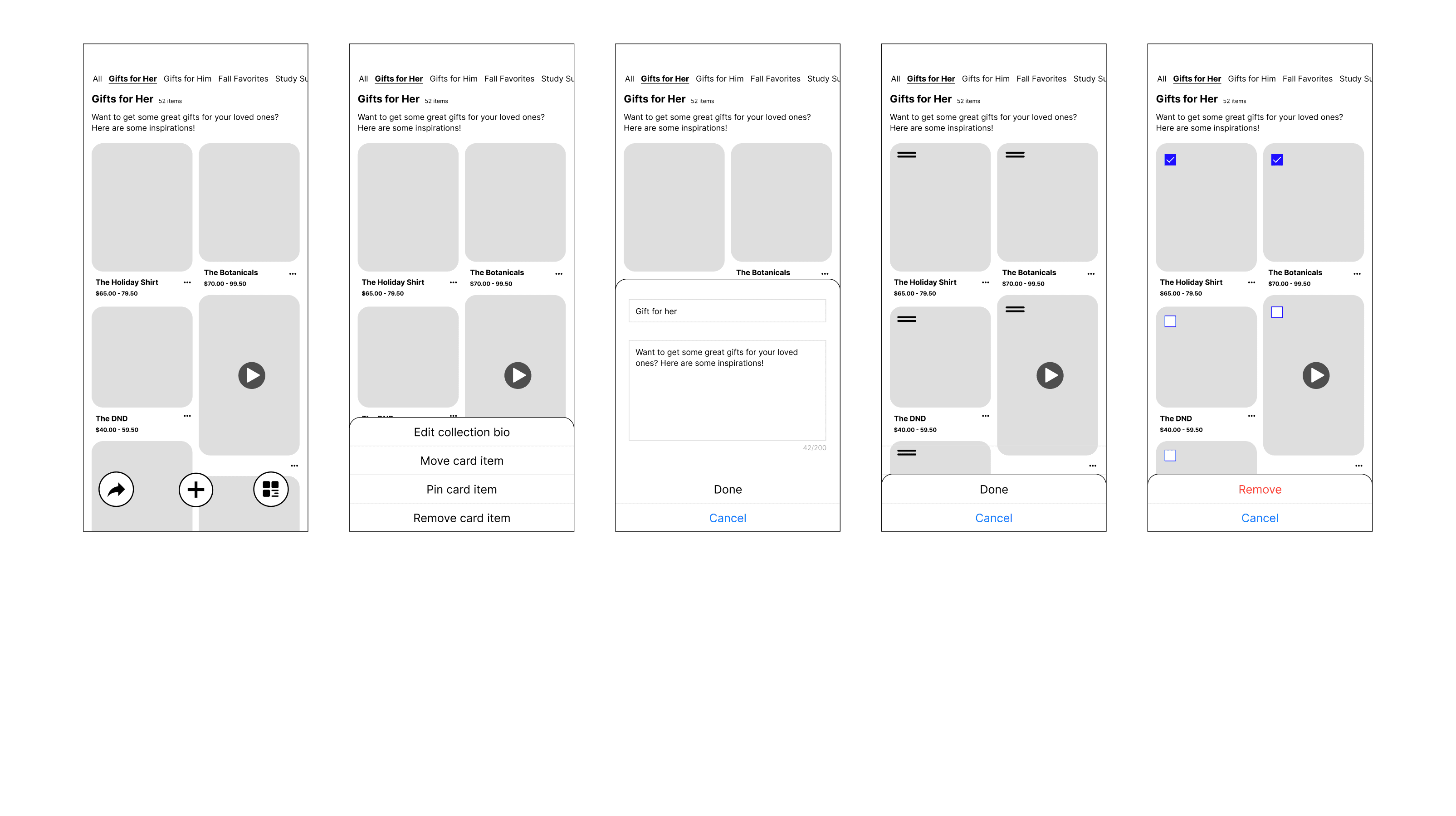
As a influencer, I want to be to rearrange the products into categories of buyer interest (ex: specific occasions, recent order/purchase history, specific categories) so that my storefront visitors can get inspired and be more likely to shop some products
2
As a influencer, I want to a simple way to manage my collections, product & UGC so that I can save time maintaining relevance of my storefront to buyers
3
User Flow
With the user stories in mind, we created three user flows, each addressing the steps the user would go through. Throughout this process, we identified several logical issues that hindered our ability to establish a sustainable structure for both the interface and backend database.
Setup flow
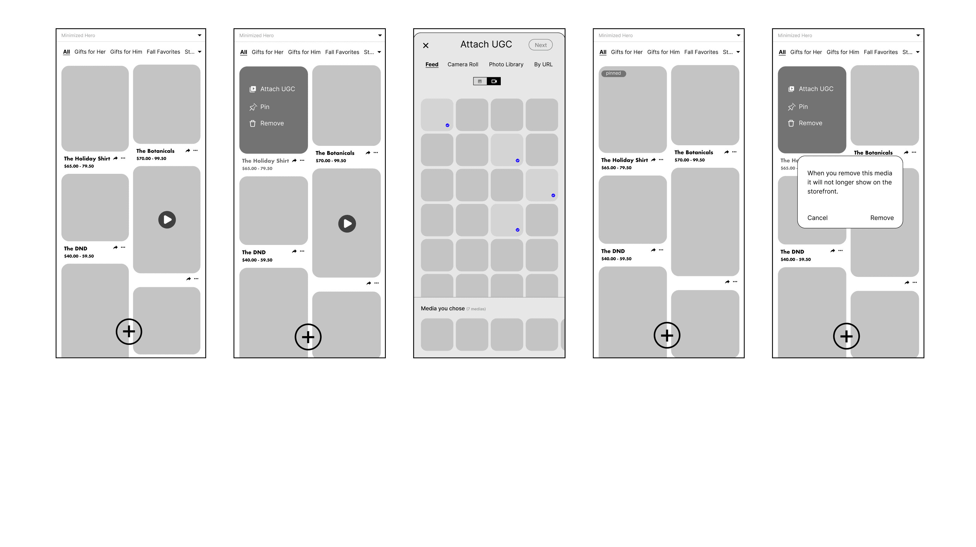
Rearrange flow
Manage flow
Scope
Work distribution
My responsibilities are managing and rearranging the flow. While areas that are grayed out are primarily handled by another designer, I help with consolidating and organizing the files.

Star (*) indicates that bulk actions are possible
Structure
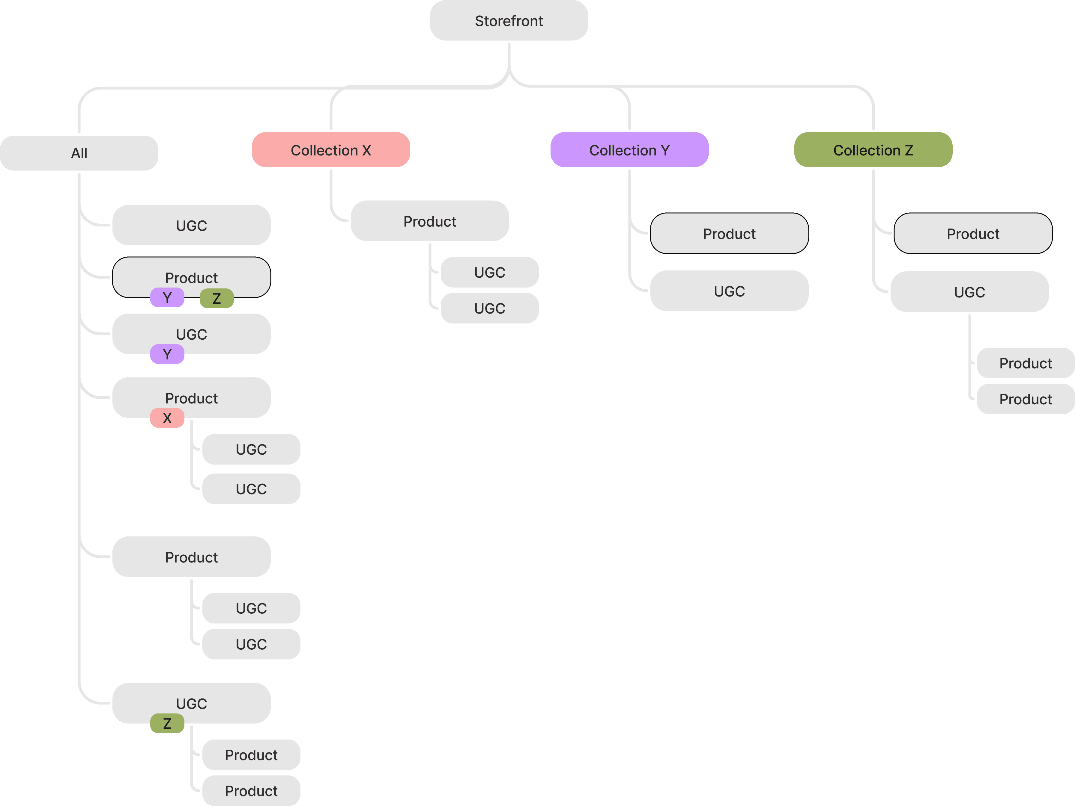
Sitemap
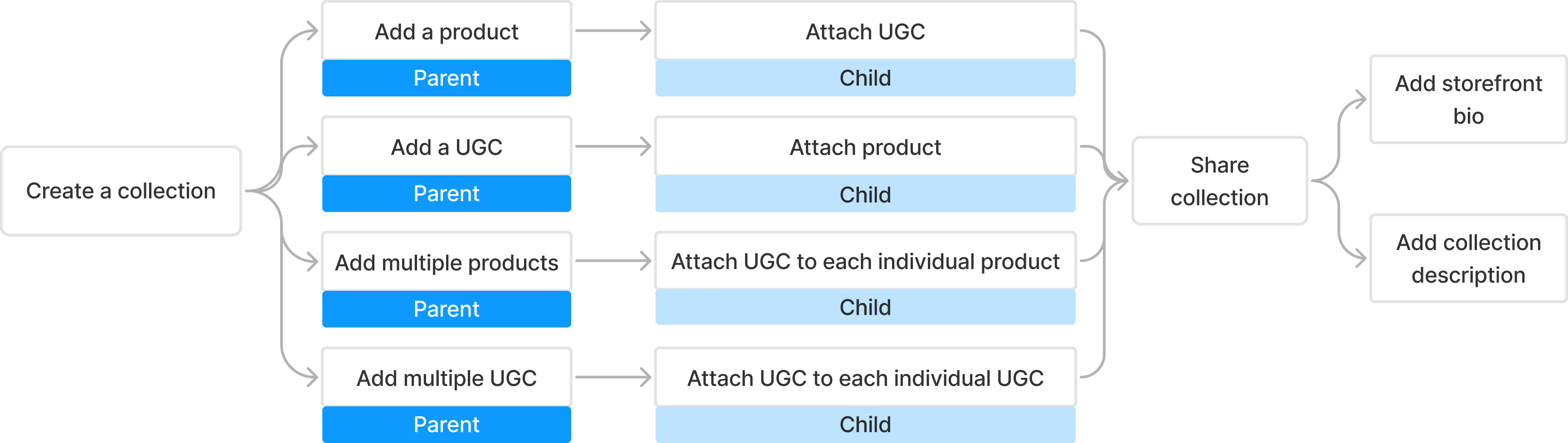
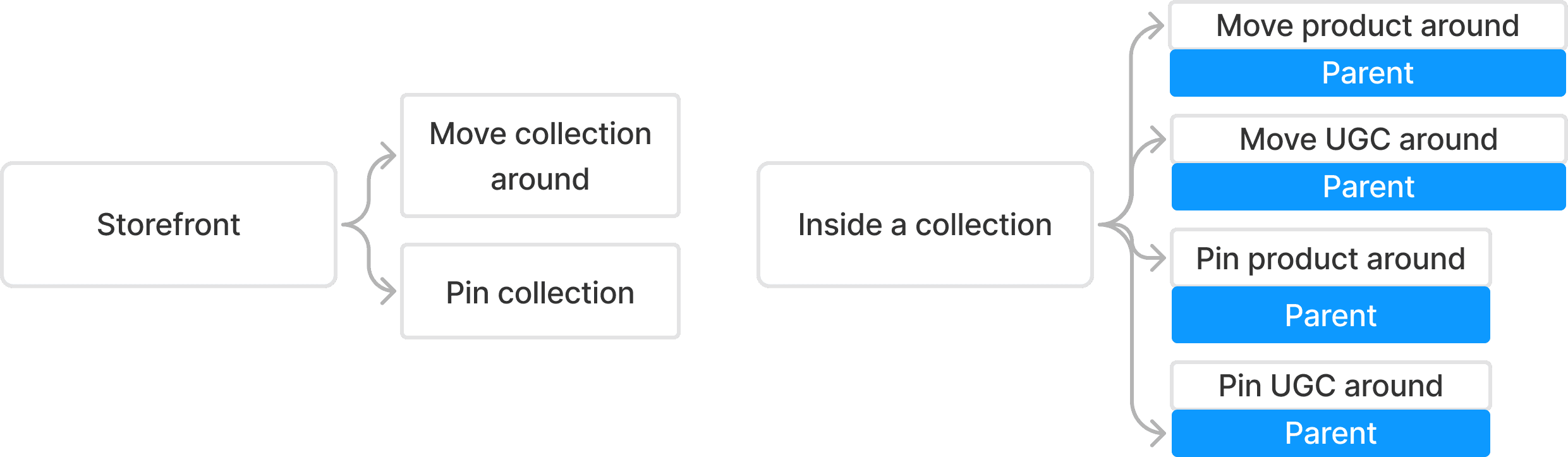
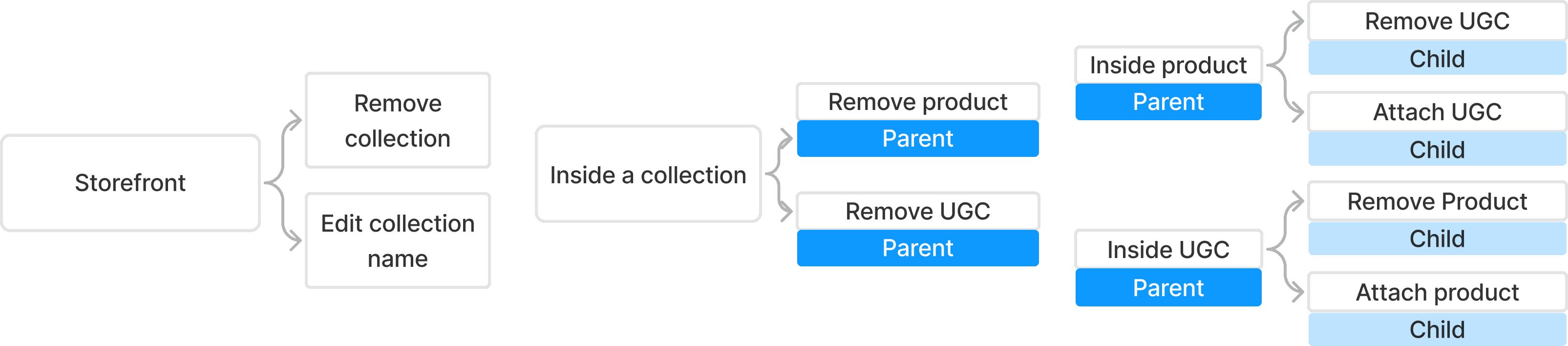
This sitemap illustrates the definitions of parent products, parent UGC, child products, and child UGC, along with their interrelationships and possible combinations within a collection. Rules designed to prevent loops and ensure system integrity in backend engineering are highlighted and explained in red.
1
2
3
4
5
5
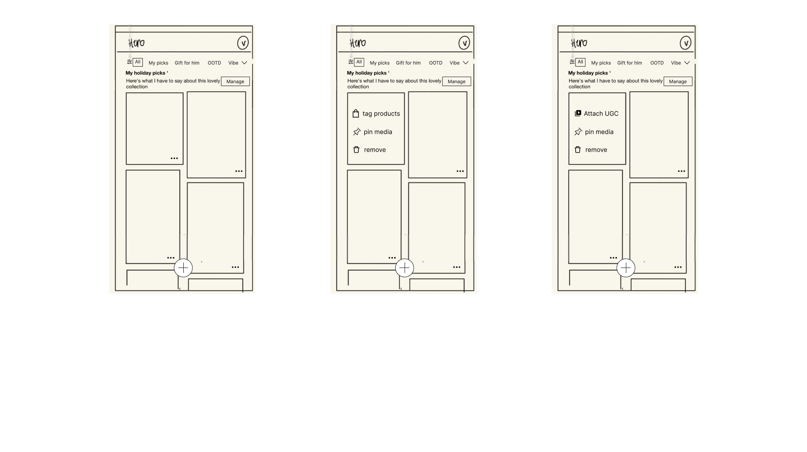
Product with 1 or more UGC attached is a parent; attached UGC becomes the child
UGC with 1 or more products attached is a parent; attached product becomes the child
Only parent can be pinned and shared
Deleting parent will delete the child
Deleting a child will go through the parent
you can create collections in all; "All" has all the collections; you can filter by UGC or product in "All"
you can add media and products in collections; collection has UGCs & products
Same product can exist in multiple collections (here is Y and Z); Deleting the copy from collection Y will have no impact on the copy in collection Z
Empty state: creators see "All" page populated by UGCs already approved by brand through the corresponding ambassador program.
Creator can also add new UGC that is not pre-approved to enhance the storefront.
Interface
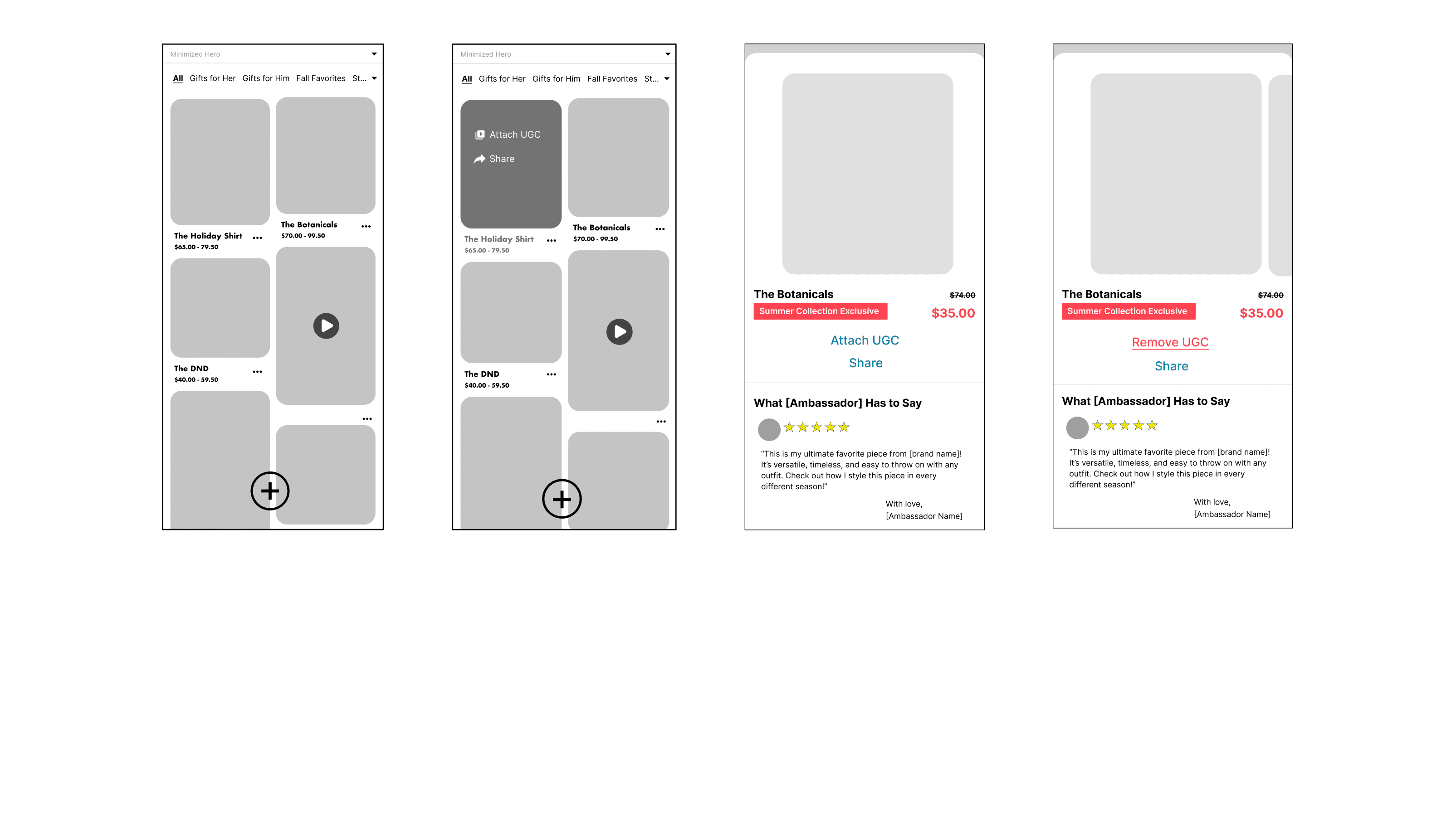
Since I was only in charge of the rearrange and manage flow, I do not have to build everything from scratch. I was able to take the "All" page sketch from the other designer and work upon a basic layout structure.
Collection list iteration
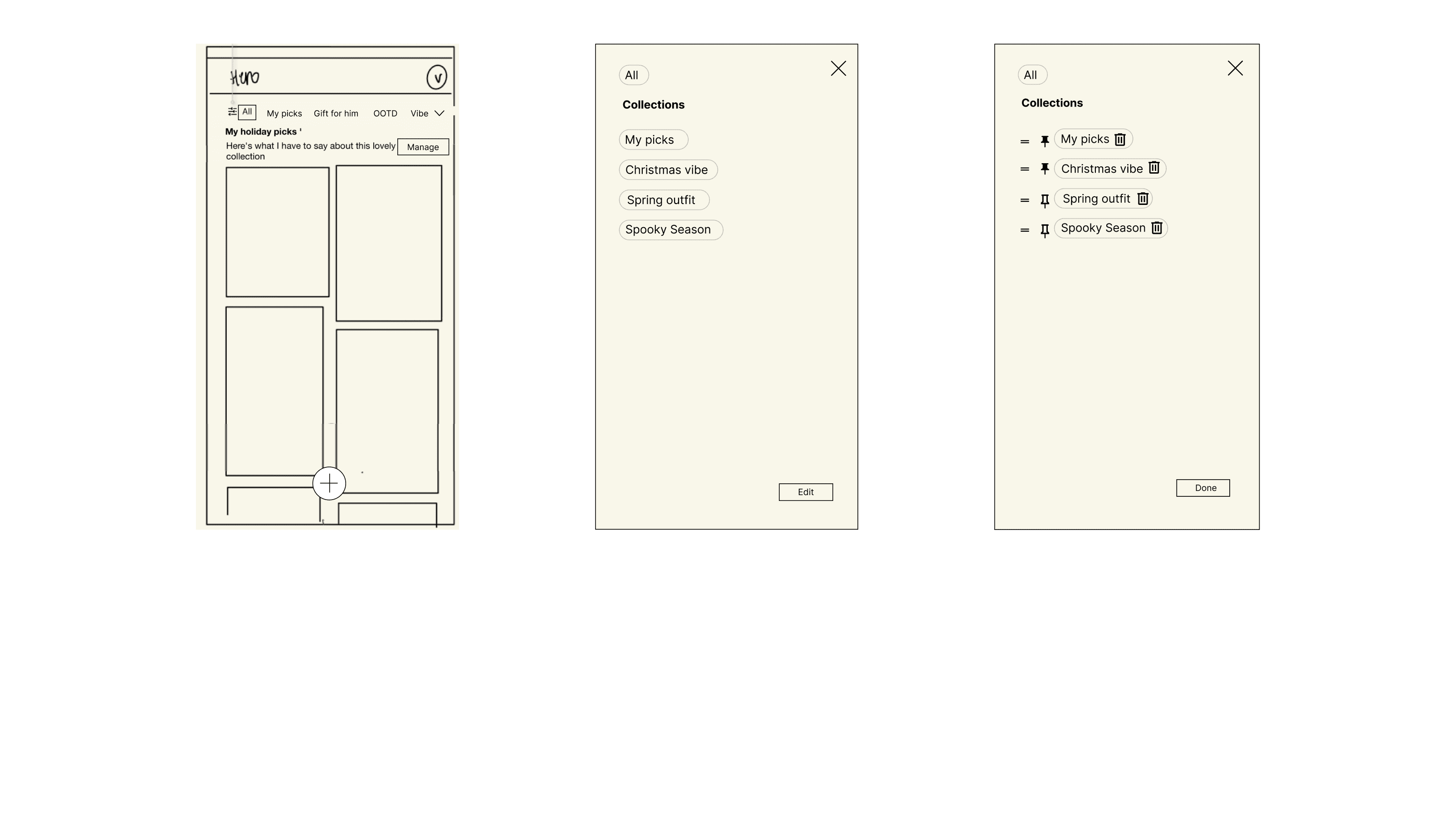
Collection management iteration
Individual card iteration
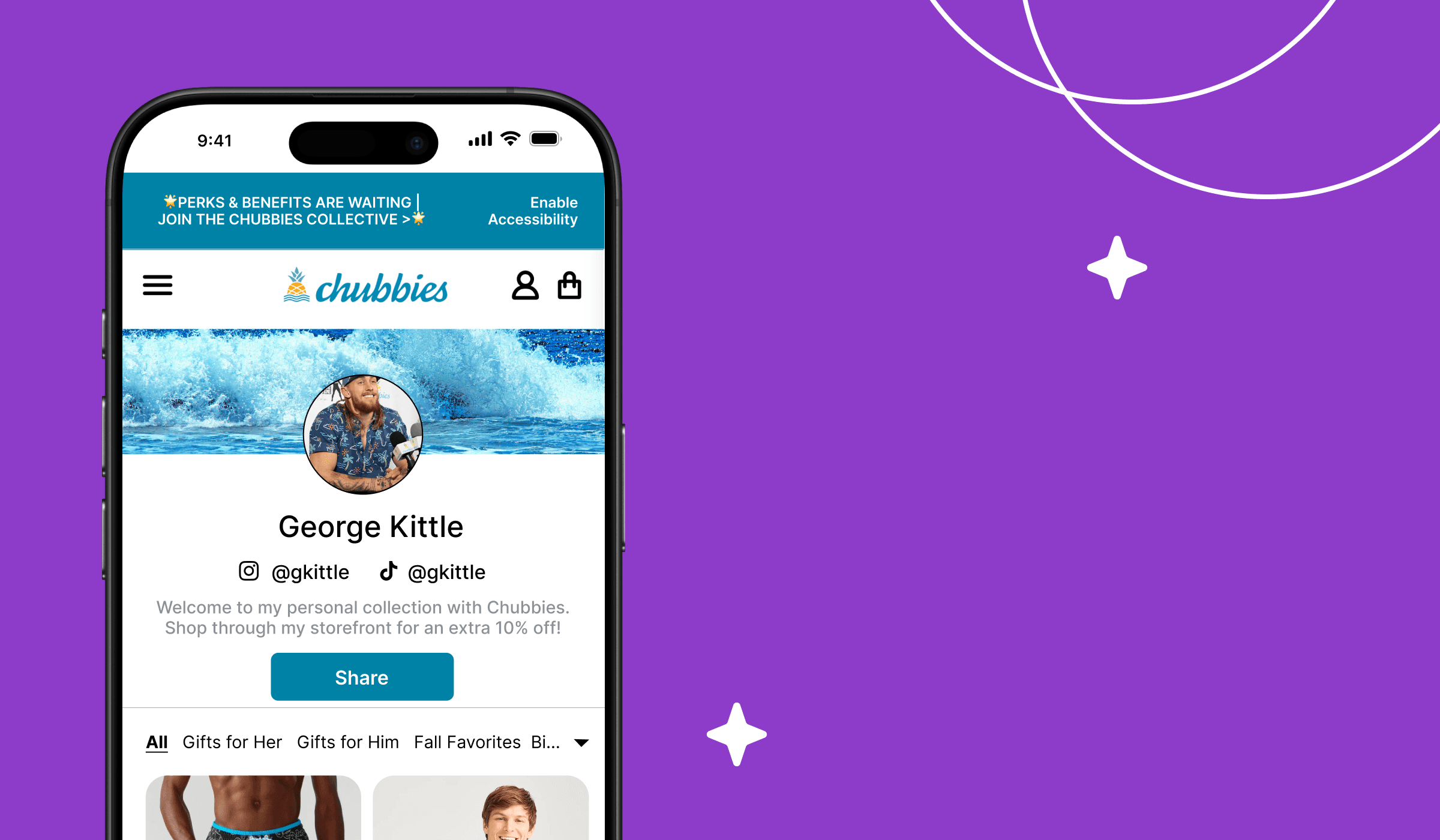
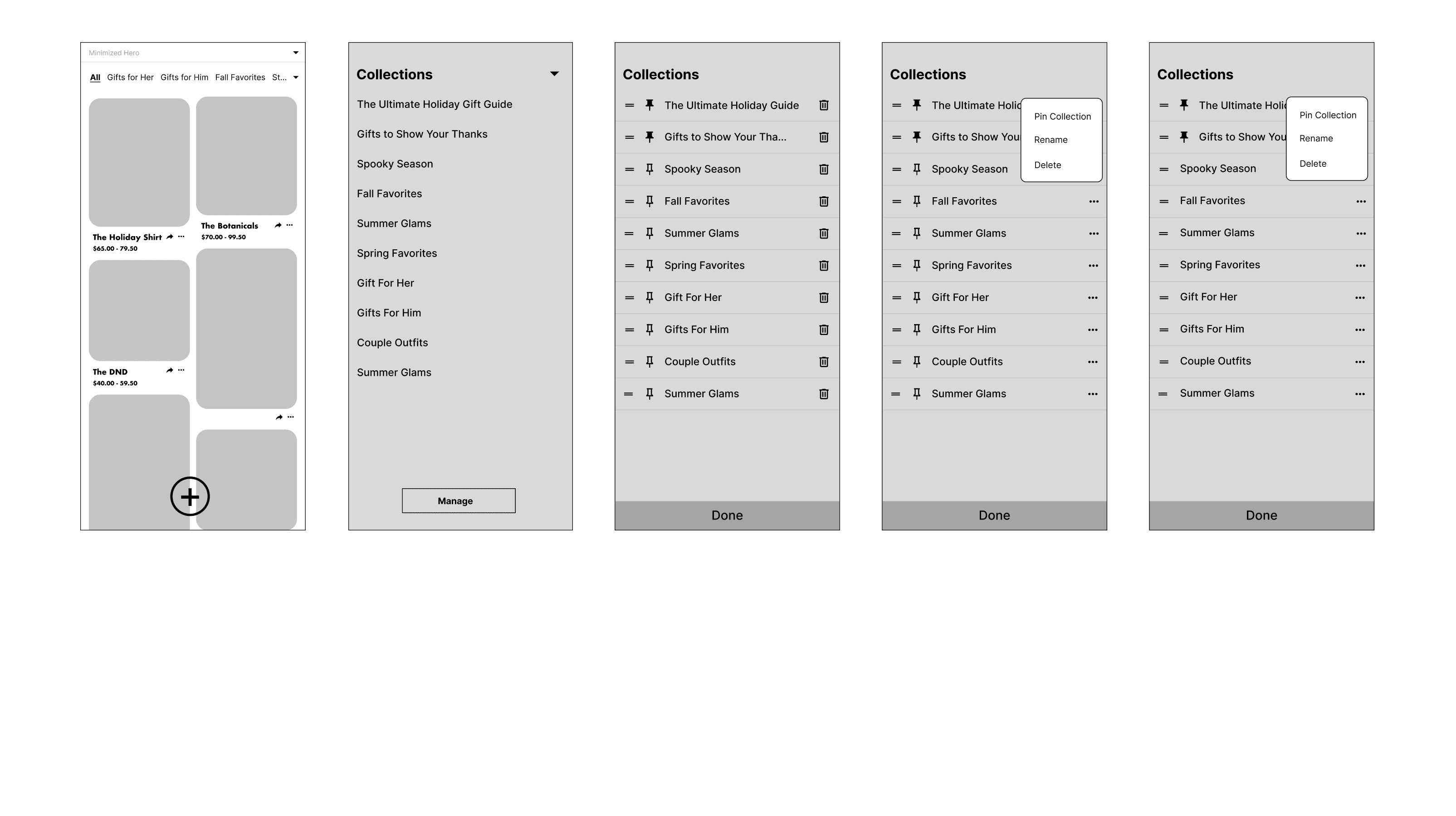
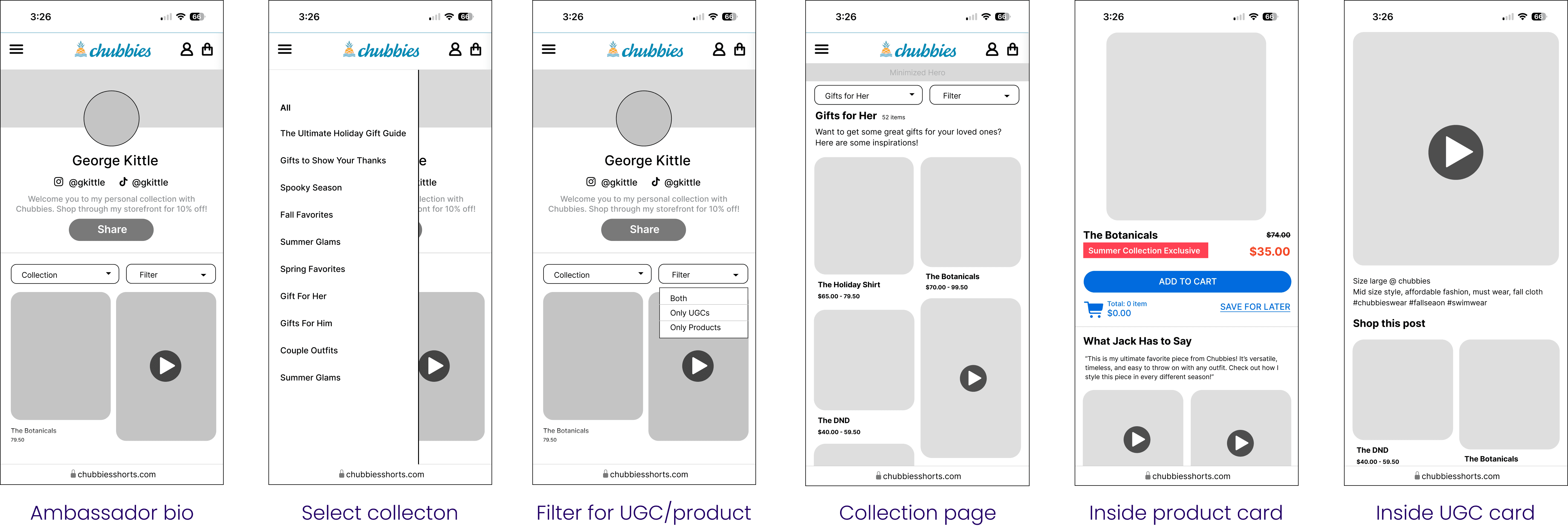
Final design - ambassador's view
In the very end, I combined my work with the other designer to create a complete flow. We documented details need for engineers to follow.
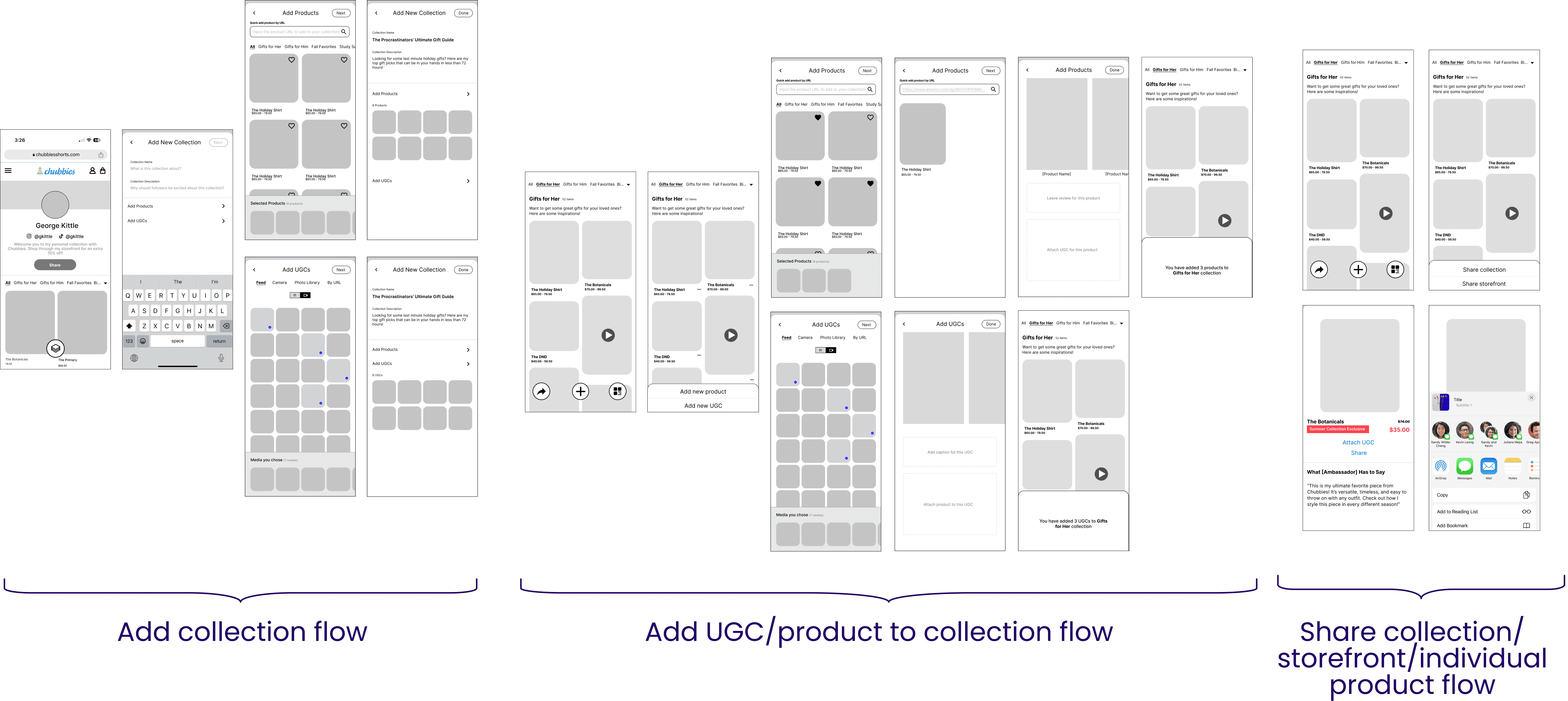
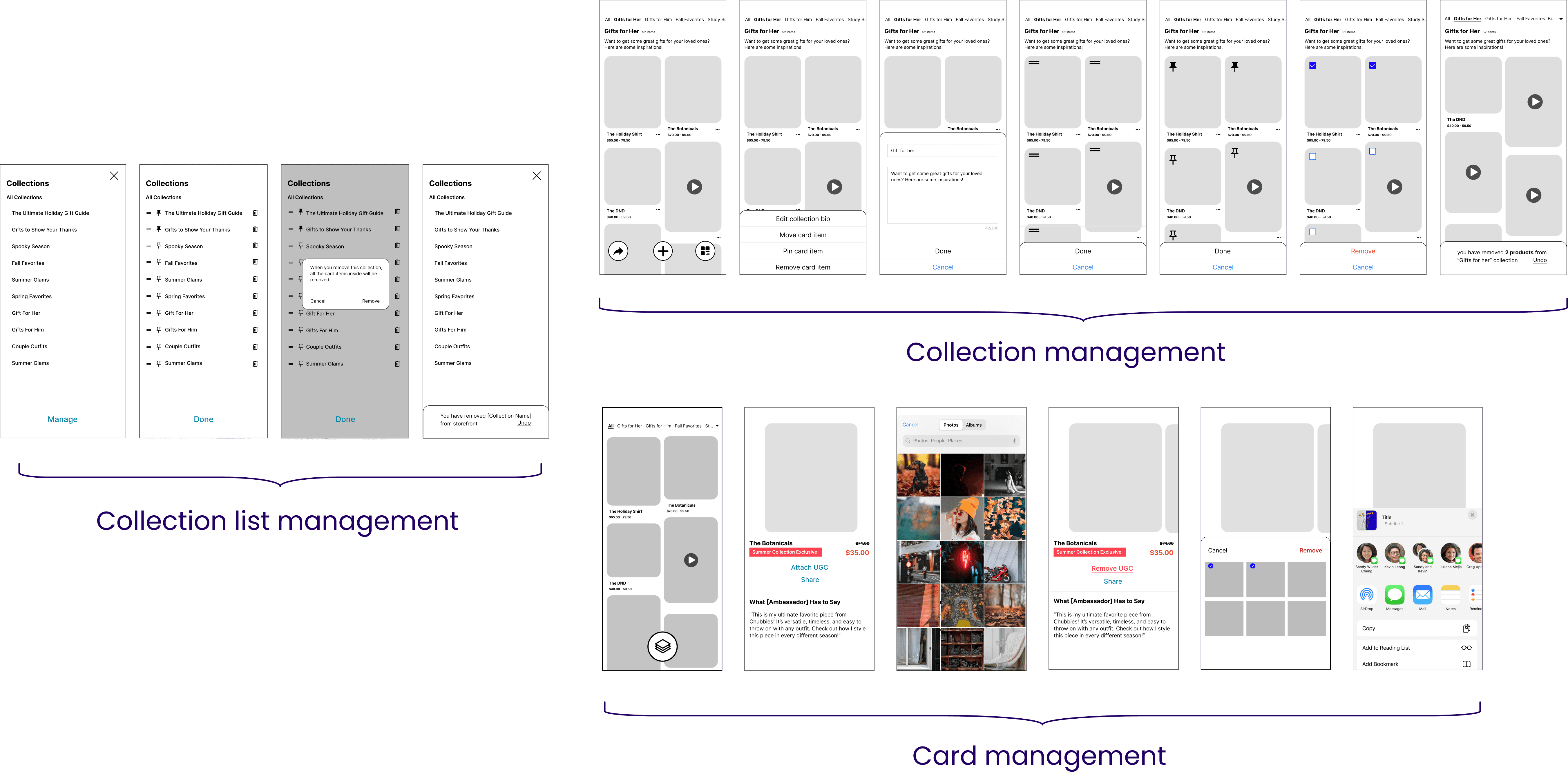
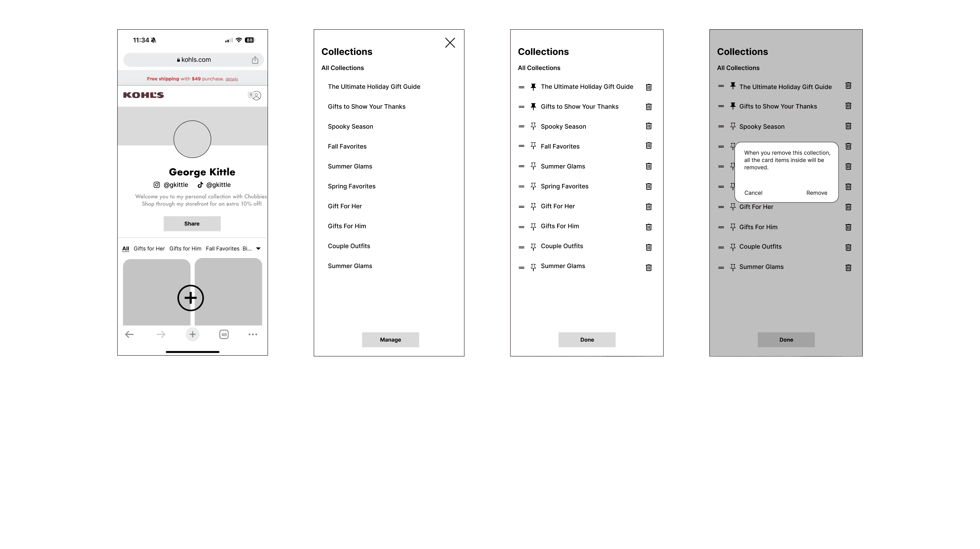
Final design - buyer's view
I also worked visitor's view we know what the storefront visitors will see on their end.
Usability Testing
After this mid-fi prototype was done, we showed it to the Root Pretty's influencer again to see how usable this design is by asking the influencer to 1) create a collection 2) add a product. Based on the insight we came up with recommendation for next revision.

Reflections
Less space: Mobile design restricts space, making it harder to fit the same amount of content as on desktop.
Different user, different experience: We need to set up the entire flow considering different viewing perspectives, such as the ambassador's and the buyers.
Collaboration is key: Each of us has a different structure, but we benefit from exchanging valuable advice.
Default logic: The most confusing aspect arises when product cards and UGC cards are mixed together. So, what determines how things are shown? (Most recent? Most relevant?)
Communication is key: Design updates need to be in sync for both designers to ensure right alignment.
Scalability: It is hard to build a foundation information architecture and structure with scalability in mind.
Feature prioritization: We removed many features that was presented in the final mockup simply because the project becomes too big for V0. Finding alternative ways ensured the "slimed "version still works logically is a lot of work.
Not every issue requires a solution: Some edge cases may be left for users to resolve themselves, especially if the problem isn't severe. Users often surprise us with their creative solutions.
Thanks for reading till the end :D
© 2024 by Benyin (❁´◡`❁)